
I've had a few reader requests to show more of the behind the scenes process that goes into taking a website from idea to finished product, and I just finished a design that uses a photoshoot that I couldn't wait to share!

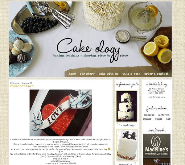
Cake-ology is a Winnipeg bakery that I adore. The owner, Pam, is an incredibly talented & sweet lady who makes amazing treats from a gorgeous bakery in the historic exchange district of our city and when she came to Freckled Nest for her design I was a little over the moon :)
Pam went through the creative homework that we have clients work through and created a Pinterest board for her shop that shows the colours and styles that she loves, and from her responses I started to get a sense of what was important to her as a person & as a business owner. Her baking is crafted in small batches, from scratch with fresh ingredients, and it's made by people who are passionate about all the details of what they do. Another part of what makes Cake-ology is special to me and its clients, is that it's a small business run by women in a gorgeous old building downtown- they have a unique space that has incredible character, and are part of the movement that's making our downtown a vibrant and welcoming community. I wanted to make sure that Pam's web design communicated the culture that she's working to create in her business and that has as much personality as she does, while being stylish and familiar to make sure her catering and wedding clients would feel comfortable navigating the site.
From her homework answers, visual inspiration and keeping the values of Pam's business in mind, I created an inspiration board that pulled themes from her responses that we could use as jumping off points for her design.

Of all the pieces of Pam's design inspiration, I was the most excited to feature her baking and to display it with pieces of vintage kitchenware that Pam loves as much as I do (which was my designer's dream come true!). Because I knew she was open to a photo based banner design, my first step was to gather and edit a collection of vintage kitchenware from my home and from local thrift stores so I could make sure I had a variety of textures and colours from her colour scheme- lemon yellow and robin's egg blue. I sent this numbered photo over to Pam so she could let me know which of the pieces she was the most drawn to.

After I knew which pieces she liked the best, I started imagining how I could use those along with her baking to create a header design that would anchor the design. After a lot of brainstorming I created a basic digital sketch of my concept for her and added explanations of what each item was.

She loved the idea behind the header design- so it was time to schedule her shoot! On the day of the shoot I picked up a beautiful cake and lots of colourful cakettes, along with fresh lemons and berries to bring depth & natural colour into a vignette that featured a lot of glass and shiny metal objects.


With the header shoot done, we worked together creating elements for the rest of her design to make it easy for her clients to navigate the site & give them all the information they need to fall in love with her business. As part of her package we added an easy to update, flexible gallery where she can show off her cakes and a custom contact form that lets her clients contact her directly from her website.


Working on Cake-ology's deisgn was so much fun, and Pam loves the final results. It's always exciting for me to help my client's find visual ways to represent the heart of what they do so they can connect with their ideal clients, but being able to work with a business that I really admire & respect in my city has been a really wonderful & special experience :)
You can explore Cakeology's site or learn more about Freckled Nest Design
and if you're a Winnipegger who hasn't been to Cake-ology yet? Go get a cakette!
LAST UPDATED ON: December 12th, 2011
CATEGORY: Content Marketing Strategy
Stunning!! It’s lovely and inspiring. Thank you for sharing! I looked around the site too, and love the look of all those cakes. Beautiful AND delicious-looking.
dang girl.
this looks rad.
i’m super impressed.
thanks for the behind the scenes peek.
Reading the inspiration behind the creative process was fantastic. The end result is just stunning :)
Very inspiring! What kind of design programs do you use?
I love this look at your creative process, it’s so insightful! Beautiful layout as always!
I absolutely loved this behind the scenes look at what you do. You just blew my mind with your awesome-ness. Just when I thought I couldn’t like you anymore you go and prove me wrong. So impressive!
Oh Kyla, I am simply blown away by your creativity! I am not surprised Pam is delighted with the results. Well Done!
Toni xo
Holy moly, Kyla… This is, hands down, one of my favourite FN designs EVER. That header is absolute perfection! Amazing job :)
xo
Ky, that looks so awesome! Nice work as per usual. You got mad skills, girl.
so very cool. i love the design. especially love the colors.
this by far is my favorite makeover you’ve done so far Kyla, way to go! (this is LA’s sister)
Beautifully stunning work!
Thank you for sharing! The results are amazing! It looks so fun that it’s like it’s not even work :)
Luvv, Leigh B
This is great. You are so talented. Love it. And it’s making me kinda hungry.
your designs are amazing. it’s always so inspiring to see what you’ve come up with!
You always put so much thought into your blog designs and that really shows. You are so talented and amazing at what you do.
My gosh – this is super amazing! Beautiful photography and a lovely layout. Gorgeous :)
Kyla, you’re super talented!
You’re so talented Kyla :) I love what you created :)
Remember when we ate the cake afterwards? mmmmm, there was so much anticipation ;)
I am amazed by people who do blog design. I don’t think I’ll ever quite grasp it myself, but it’s fun to admire the works of others. I seriously love this design. Cake-ology is the best, and now I’m craving one of Pam’s cupcakes. ;)
I’m always so impressed with your blog designs, Kyla. You put a lot of effort in to genuinely please your clients. It’s really inspiring.
This post just made me super hungry lol
-andrea lynne rose
http://madmus.blogspot.com/2011/12/15-days-of-scarves-day-3-vintage-golden.html
you made me all teary Kyla! thank-you for putting so much heart into your work. it was as much my pleasure to work with you on this. thank-you for all the kind words!
Thank you so much for sharing this. I love to get some insight into your design process. It’s so inspiring and it shows how much hard work can go into one header. Amazing, I love the result.
Zelde
The header (and the whole site!) is gorgeous, and I love getting a peek into your process! Thanks for sharing :)
I absolutely love the header!
You’re so clever! I love this. Thanks for sharing the behind the scenes steps, really helpful lesson in not jumping straight into the photo shoot without some proper planning first,
All your designs are gorgeous but this may be my favourite one yet! I love, love, love the header. It’s perfect! It was so interesting reading all about the steps that went into designing this site Kyla! You are so talented and creative. I can’t wait for you to re-do my site eventually :)
Oh wow, what a lovely design! It captures the essence of the business perfectly; feminine, personal and full of yummy goodness (^_^) I’m now super hungry for cake – all those delicious goodies look amazing!